

This tutorial explains how to display responsive image in react native application. The best part about responsive image is automatically adjust to fit the size of the screen or auto fit to mobile device screen. if you are remember about <Image> component in react native application it does not keep image aspect ratio which results in the image being stretched or cropped. So here we are going to discuss about new library that helps to create responsive image in android or ios device easily.
react-native-scalable-image solves this problem by calculating the image size and resizing the image when rendering. This library provides an <Image/> component which scales width or height automatically to keep the aspect ratio.

Library used :
Installation Command :
Lets refer the below screenshot during installation.

The following example creates an image which fits the full screen width and keeps the aspect ratio:
App.js
As you know In React Native, the component exported from App.js is the entry point (or root component) for react native application.
Screenshot :


Download Link :
https://github.com/skptricks/React-Native/tree/master/React%20Native%20Responsive%20Image%20Scale%20To%20Fit%20Example
This is all about React Native Responsive Image Scale To Fit Example. Thank you for reading this article, and if you have any problem, have a another better useful solution about this article, please write message in the comment section.
react-native-scalable-image solves this problem by calculating the image size and resizing the image when rendering. This library provides an <Image/> component which scales width or height automatically to keep the aspect ratio.

Library used :
- react-native-scalable-image
Installation Command :
npm install react-native-scalable-image --save
Lets refer the below screenshot during installation.

The following example creates an image which fits the full screen width and keeps the aspect ratio:
import React from 'react';
import { Dimensions } from 'react-native';
import Image from 'react-native-scalable-image';

const image = (
   <Image
       width={Dimensions.get('window').width} // height will be calculated automatically
       source={{uri: '<image uri>'}}
   />
React Native Scalable Image Example :
Lets check out below simple example to create scalable image in react native application. The best part about this library is automatically adjust to fit the size of the screen.App.js
As you know In React Native, the component exported from App.js is the entry point (or root component) for react native application.
- In this example we are going to use <image> component from the react-native-scalable-image package that provides auto image scaling feature the image can automatically scale itself to given width, It automatically calculates the image height according to given width as respect of image.
- Also We have placed four <Image> component with different image size and ratio inside the scroll view layout, while scrolling we you can clearly see the scalable image that auto fit to screen size in react application.
/**
 * Sample React Native App
 * https://github.com/facebook/react-native
 * @flow
 */

import React, { Component } from 'react';
import { Platform, StyleSheet, Text, View, Dimensions,ScrollView } from 'react-native';
import Image from 'react-native-scalable-image';


export default class App extends Component {

  render() {
    return (
      <View style={styles.container}>
       <ScrollView>
        <Text style={styles.headerText}> Example - 1  </Text>

        <Image
         width={Dimensions.get('window').width} // height will be calculated automatically
         source={{uri: 'https://scontent-sin6-1.cdninstagram.com/vp/ec3d2768cf3fea9f46b00f8d063496e8/5C829D3E/t51.2885-15/e35/39955778_132983540981108_5035102725543527132_n.jpg'}}
       />

       <Text style={styles.headerText}> Example - 2  </Text>
       <Image
        width={Dimensions.get('window').width} // height will be calculated automatically
        source={{uri: 'https://scontent-sin6-1.cdninstagram.com/vp/b332dfe6afb70fb22c62b17477eb61f0/5C726F8B/t51.2885-15/e35/14736276_1142115749229627_5661486251610472448_n.jpg'}}
      />

        <Text style={styles.headerText}> Example - 3  </Text>
        <Image
         width={Dimensions.get('window').width} // height will be calculated automatically
        source={{uri: 'https://scontent-sin6-1.cdninstagram.com/vp/fe70bc2b191352f4be36dec3795b9473/5C75594D/t51.2885-15/e35/14733312_1248595268517155_9138785640962326528_n.jpg'}}
        />

        <Text style={styles.headerText}> Example - 4  </Text>
        <Image
         width={Dimensions.get('window').width} // height will be calculated automatically
         source={{uri: 'https://scontent-sin6-1.cdninstagram.com/vp/dded6cee88aabdb420342d34abcfe549/5C742150/t51.2885-15/e35/36738130_269184743837735_4994613981004955648_n.jpg'}}
        />
      </ScrollView>
    </View>
      );
  }
}

const styles = StyleSheet.create({
  container: {
    flex: 1,
    justifyContent: "center",
    alignItems: "center",
    backgroundColor: "#e5e5e5",
  },
  headerText: {
    fontSize: 20,
    textAlign: "center",
    margin: 10,
    fontWeight: "bold"
  },
});
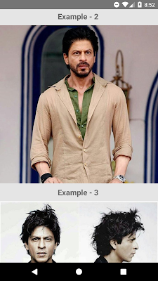
Screenshot :


https://github.com/skptricks/React-Native/tree/master/React%20Native%20Responsive%20Image%20Scale%20To%20Fit%20Example
This is all about React Native Responsive Image Scale To Fit Example. Thank you for reading this article, and if you have any problem, have a another better useful solution about this article, please write message in the comment section.


No comments:
Post a Comment